Illustrator
2022
GOAL: Redesign an already existing package/product to better fit a company's target audience.
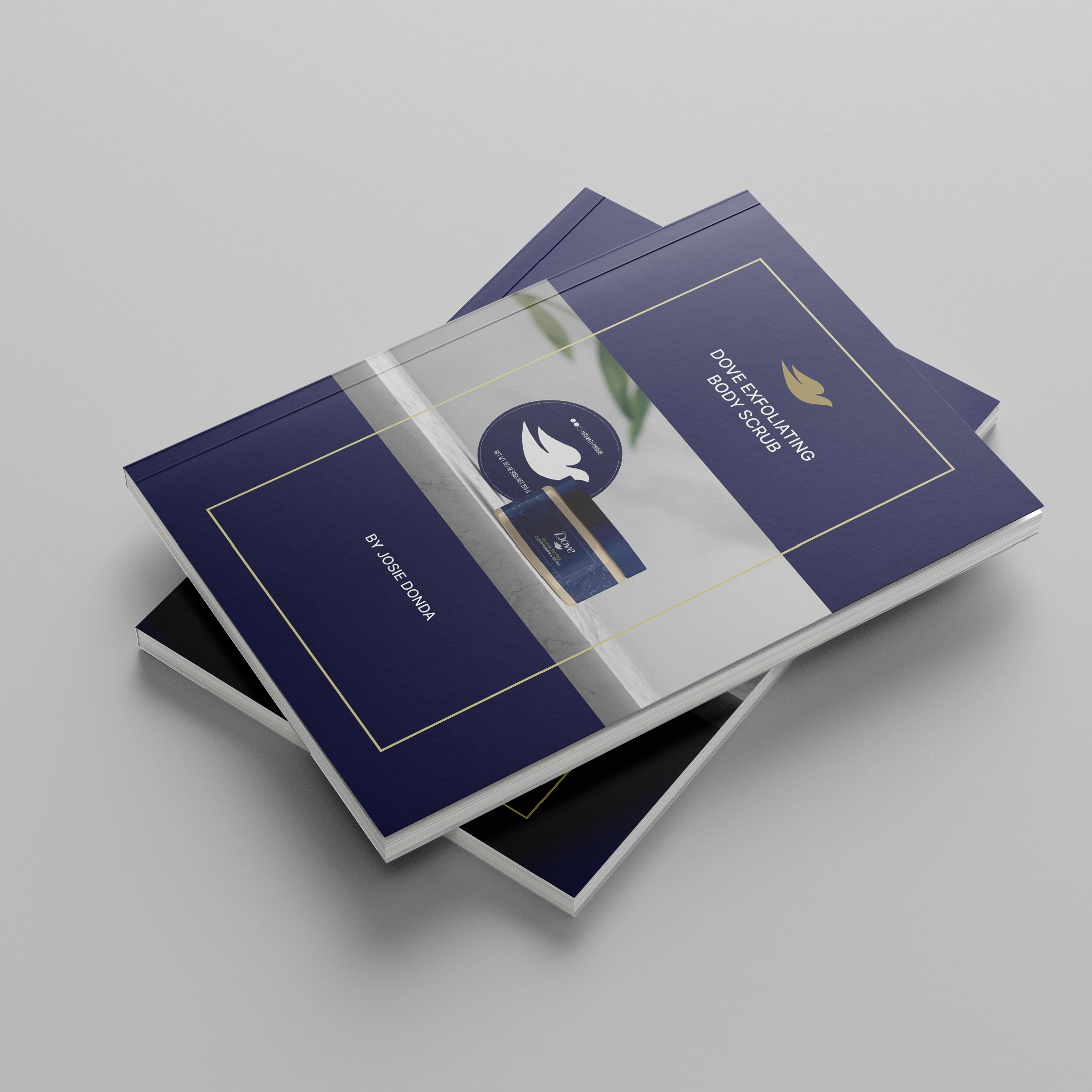
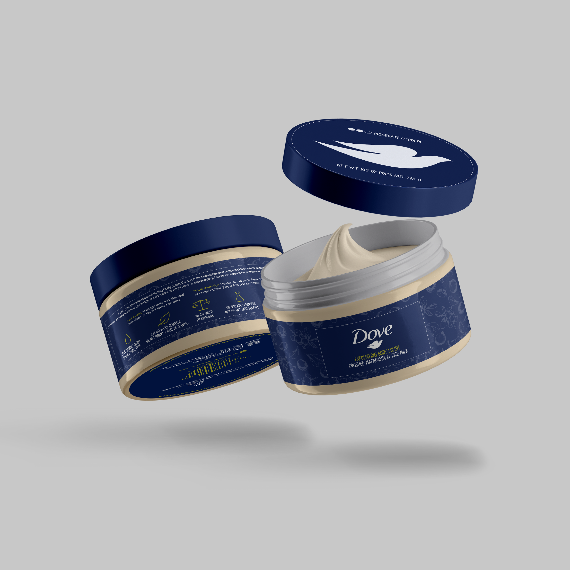
This project had two parts, to redesign an existing product's packaging and to create a research booklet of the company and their competitors. I chose Dove's Body Polish as my product to develop a new package for because I wanted to come up with a different way this company could market towards women.
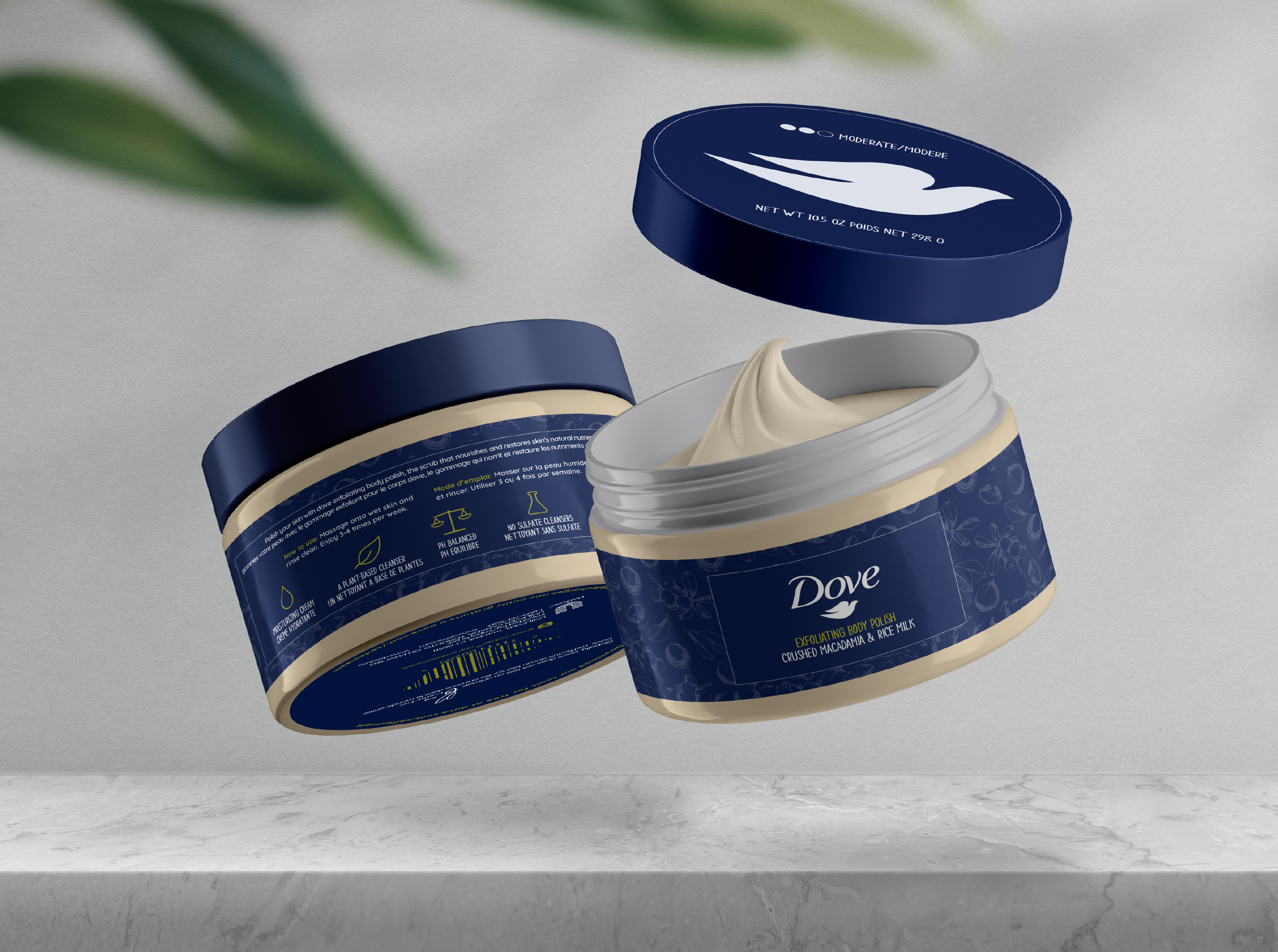
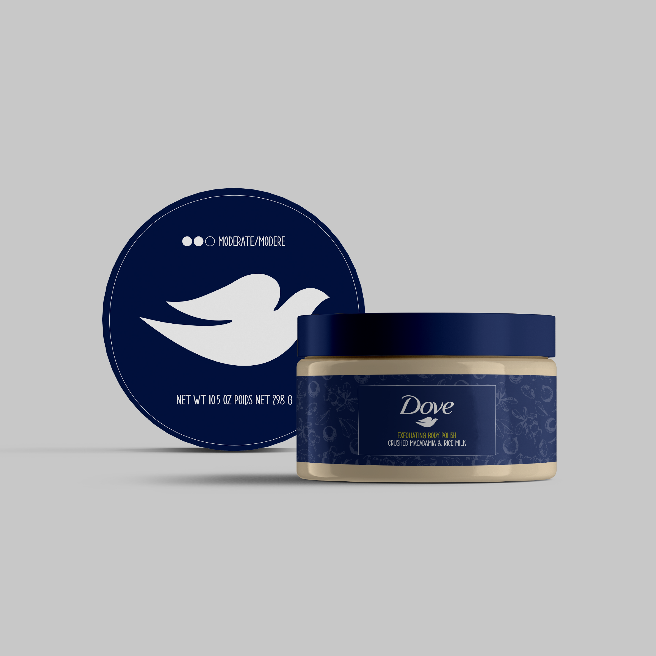
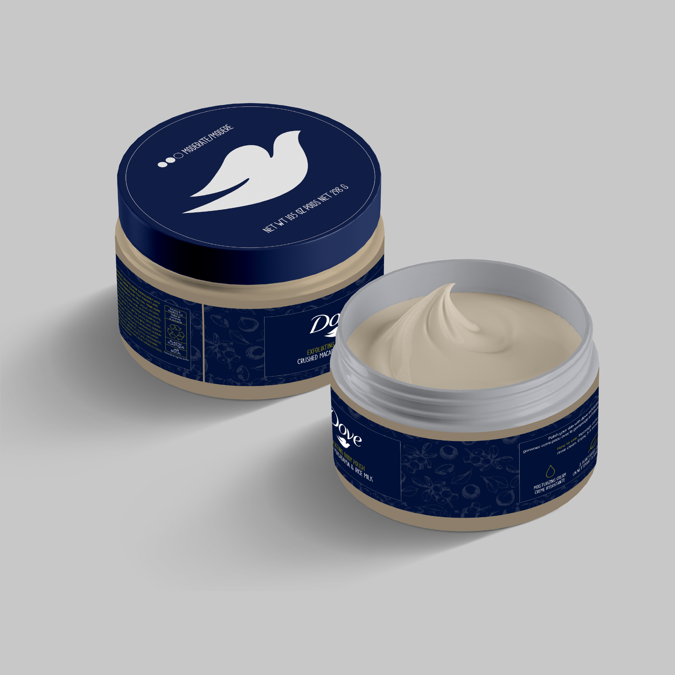
For my redesign, I aimed to create a women's product in a unique style not commonly found in stores. My goal was to transform Dove's body polish into a more sophisticated and elegant product while also breaking the traditional gender stereotypes seen in women's products. This would reflect the inclusivity and diversity of Dove's company values within my own design choices.
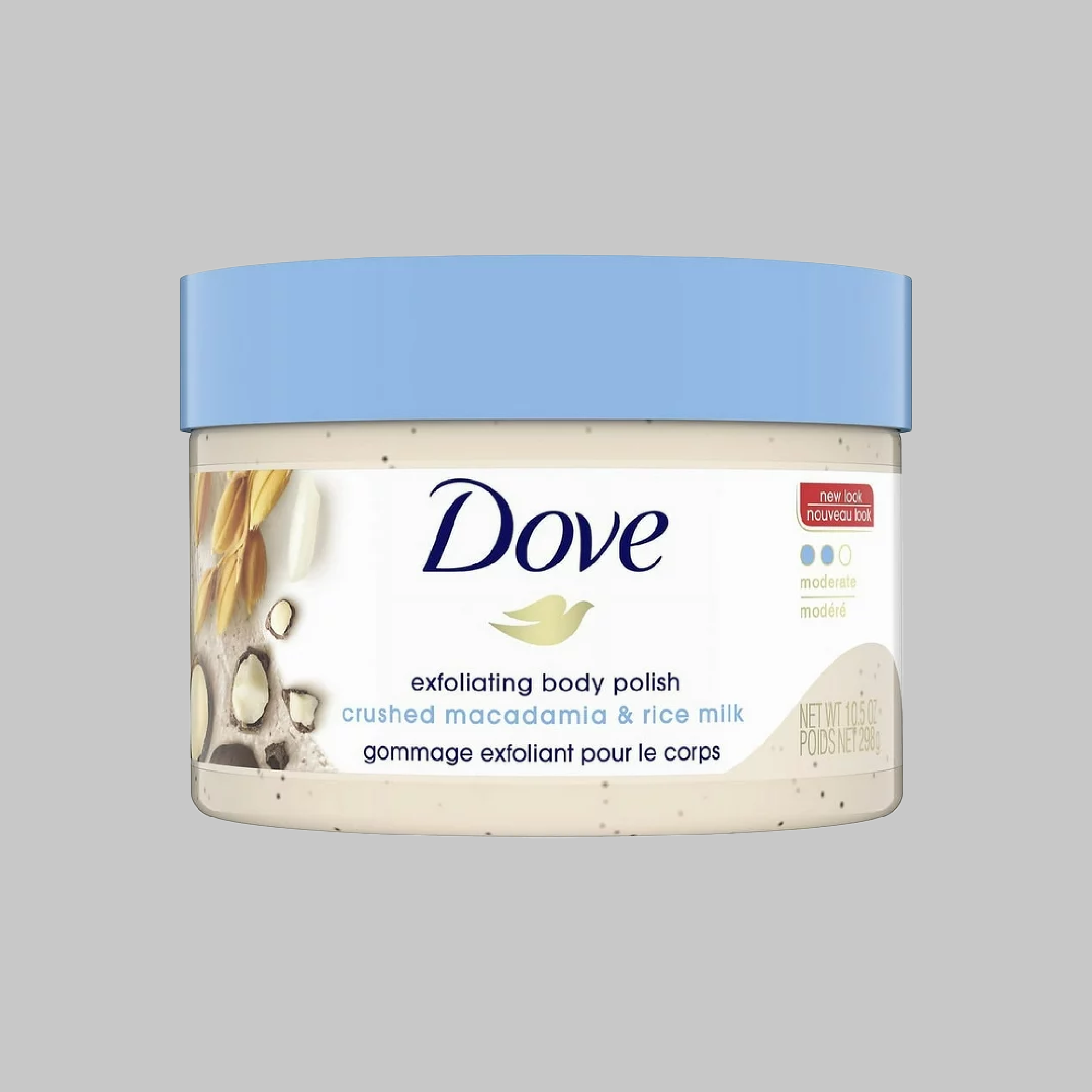
Before & After:
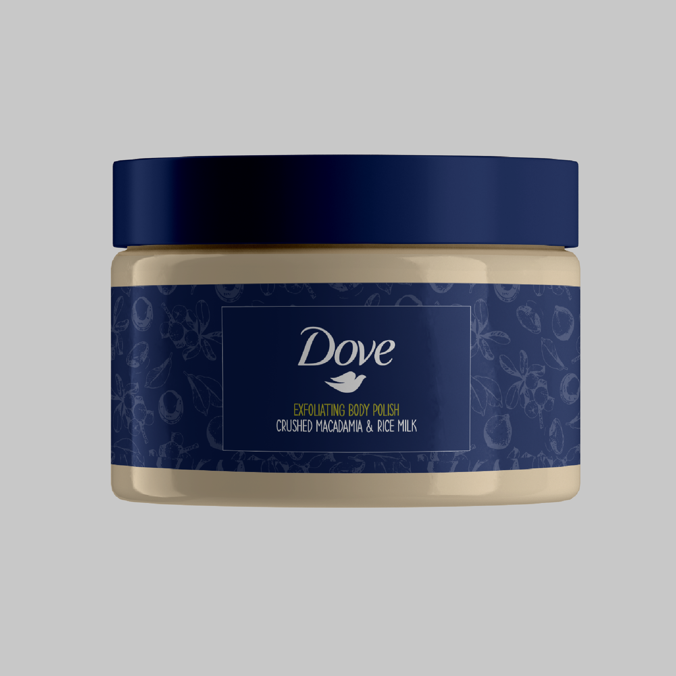
Packaging Mockups:
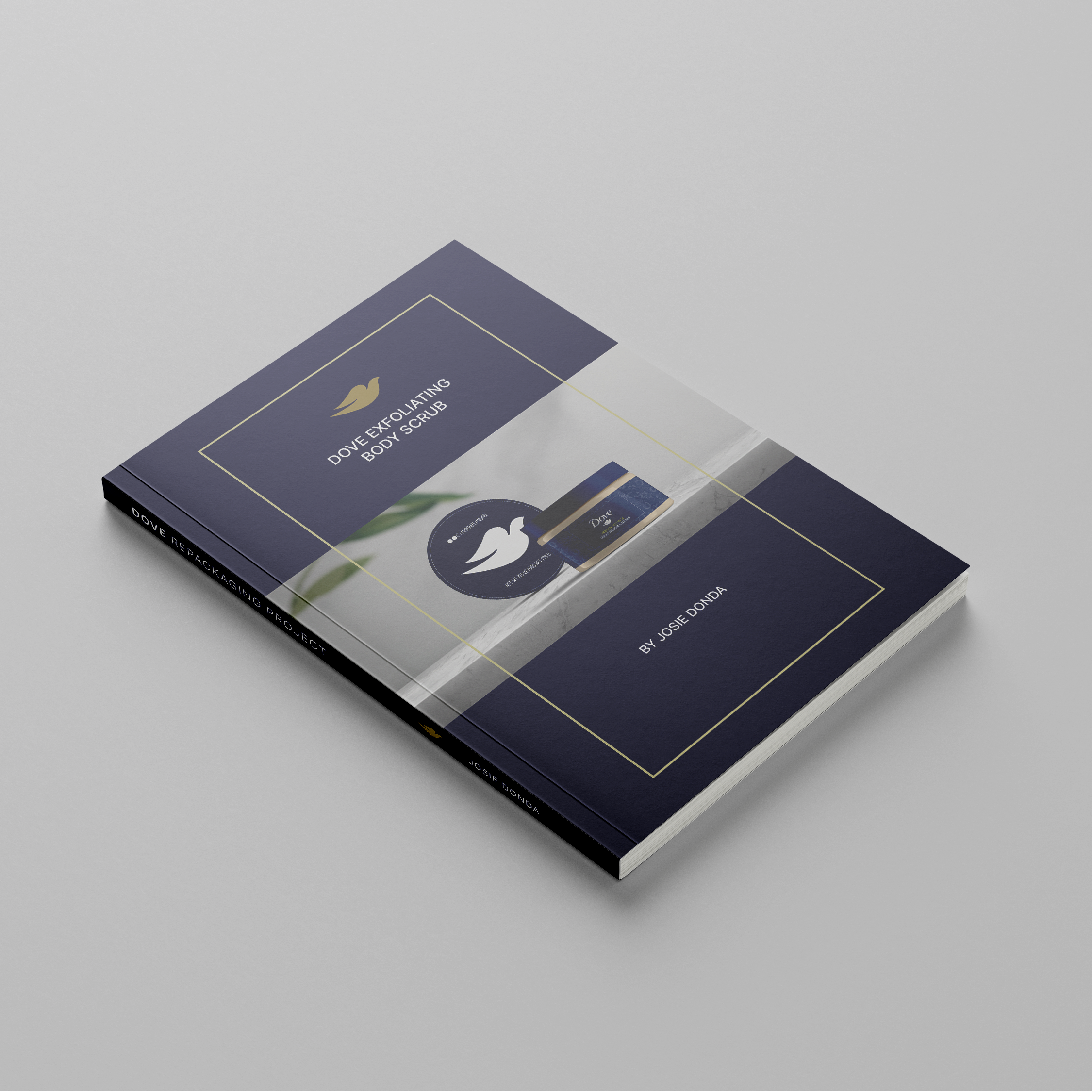
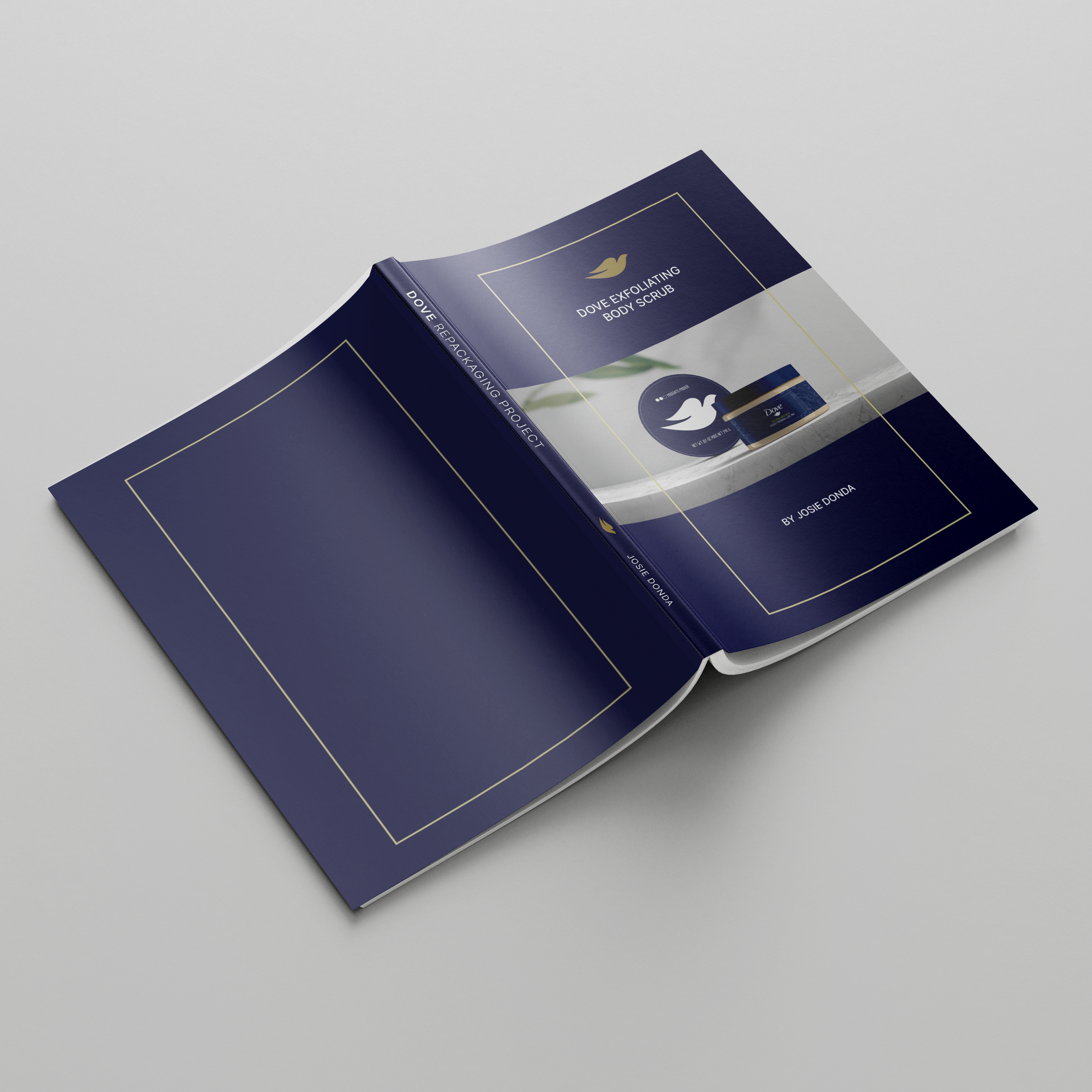
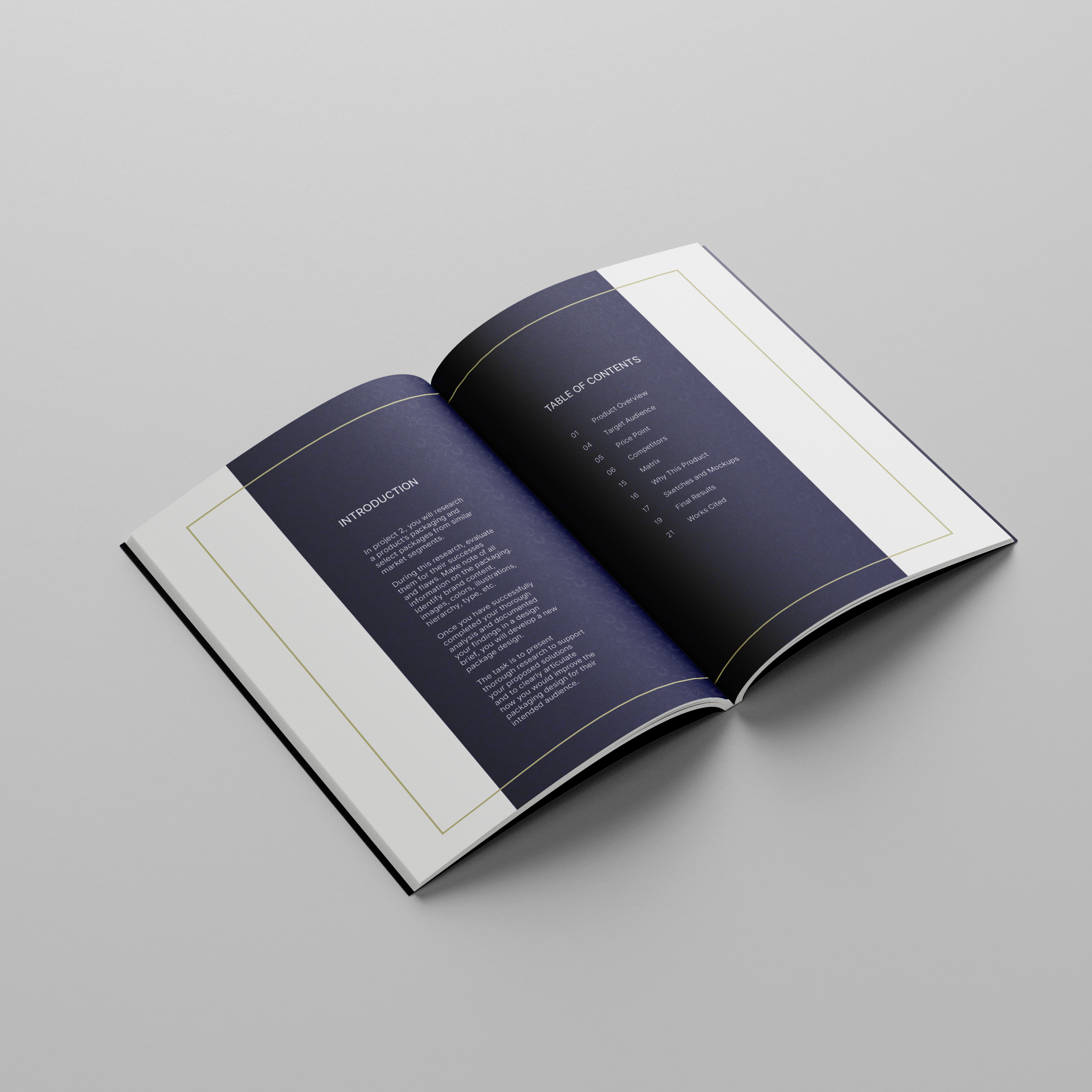
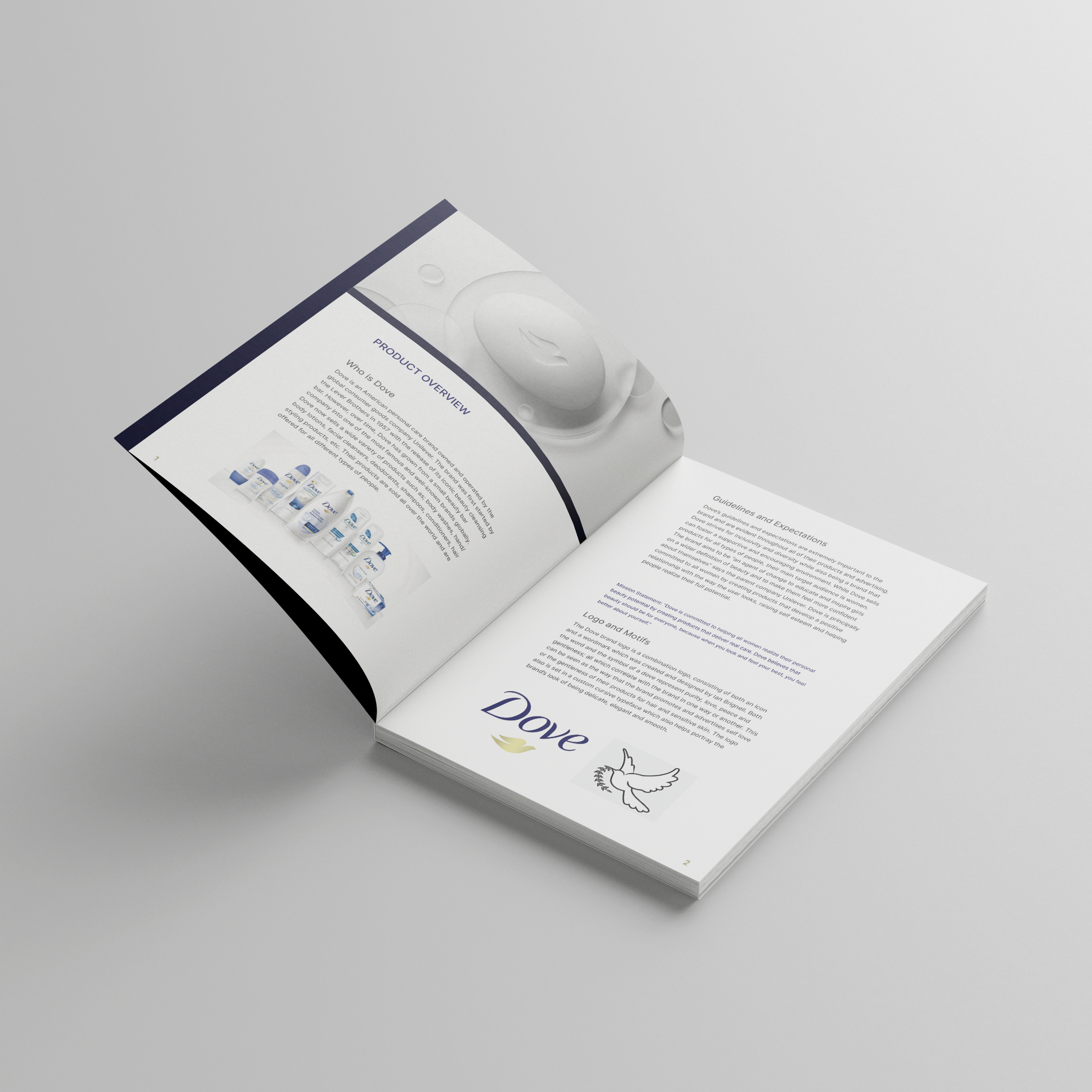
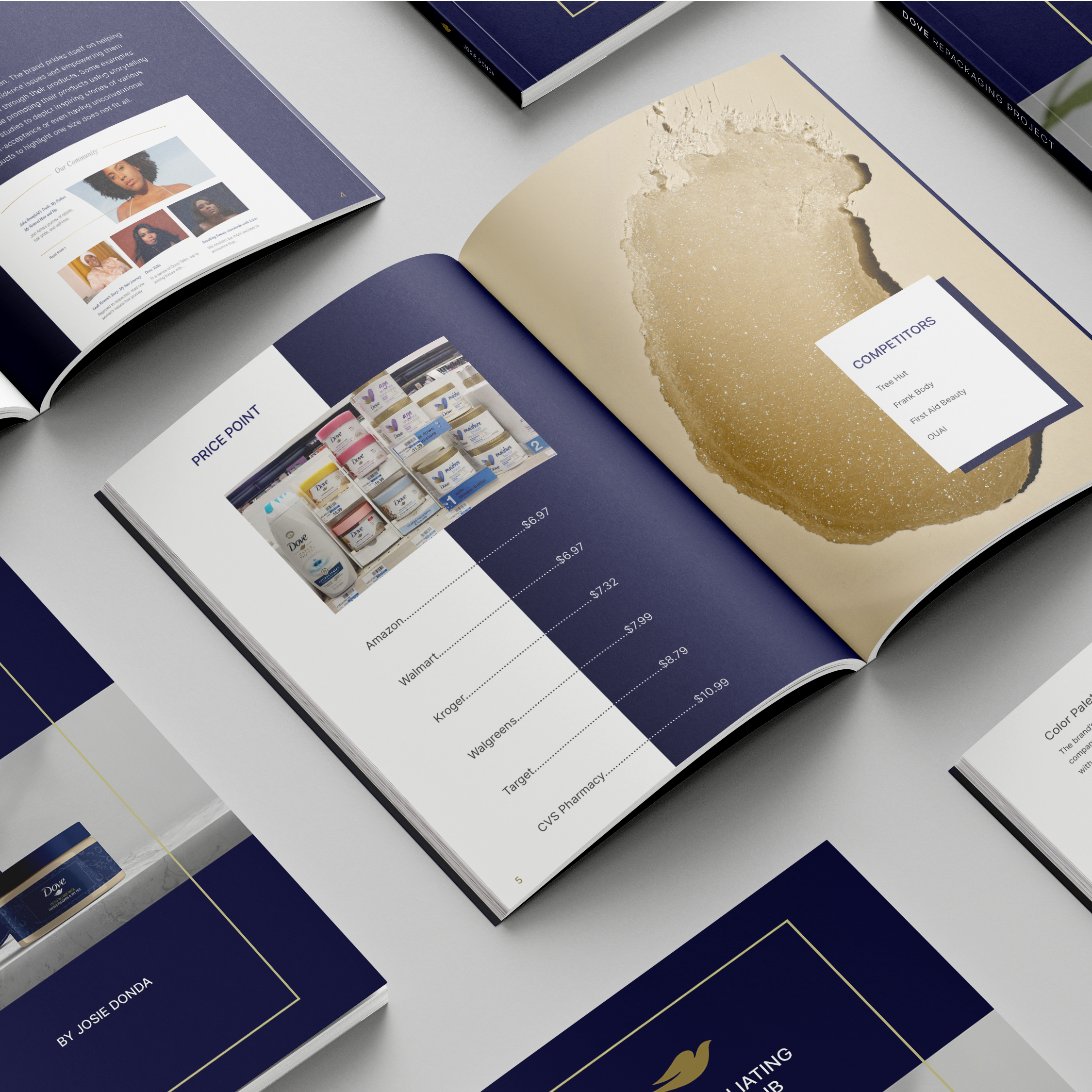
I thoroughly researched Dove's company for my booklet. I looked into how they began, their values, products, and more. I delved into Dove's brand identity, discussing their standards, logo, design elements, and color choices. I also covered their target audience, pricing, and product availability. Comparatively, using a matrix I examined their competitors, highlighting their strengths and areas for improvement in packaging. Finally, I explained why I picked this product and how I redesigned it.
Booklet Mockups:
